Introduction
This note takes a look at seven charts we highlighted in January for investors to watch as being critical to the investment outlook this year. Put simply, where are they now?
Chart #1 – new coronavirus cases
After plunging through the first half global new coronavirus cases and deaths are on the rise again, propelled by the more contagious Delta variant. This poses a new threat to the economic recovery and threatens a correction in share markets and further decline in bond yields.
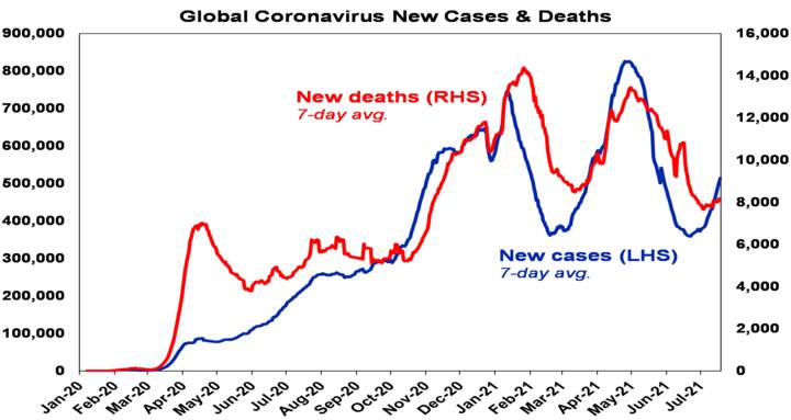
Source: ourworldindata.org, AMP Capital
For lowly vaccinated countries this means using restrictions and lockdowns to avoid overwhelming healthcare systems, which disrupts economic recovery. Unfortunately, Australia is in this camp. But experience shows lockdowns work and if they are fast and hard, they can be short resulting in a quick recovery.
However, this wave may be very different in more heavily vaccinated countries – the UK, US and Europe which are around 50% fully vaccinated – with vaccines not necessarily preventing infection but 90%+ effective in preventing hospitalisation and death. Ideally these countries should have waited to reach herd immunity (which may be around 80-90% with Delta), with new cases set to surge to higher than ever levels. But, if hospitalisation and deaths don’t surge, then they can “learn to live it” with little disruption to reopening. So far so good for the UK, but simple maths tells us it could still run into trouble if cases and hospitalisation amongst the unvaccinated run up too quickly, stressing the hospital system & necessitating the return of some restrictions. The next chart is worth watching. Some lowly vaccinated US states are at greater risk.
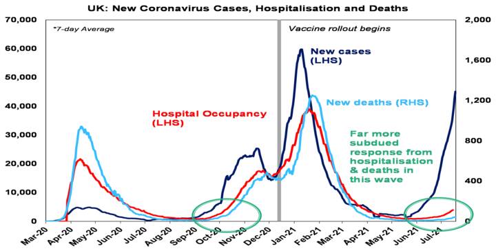
Source: ourworldindata.org; AMP Capital
With vaccine production ramping up to 10bn plus this year other countries including Australia should be able to get to herd immunity by early next year.
Chart # 2 – global business conditions PMIs
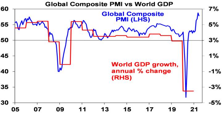
Global Purchasing Managers Indexes (PMIs) – surveys of purchasing managers at businesses – have surged to record levels globally suggesting a very strong recovery. They’re likely to slow from here but this is normal after an initial surge (see the 2010-12 period), but short of vaccines failing to head off severe illness in highly vaccinated countries and so breaking recovery, or central banks slamming on the brakes, this should still be to levels consistent with reasonable growth.
Source: Bloomberg, AMP Capital
Chart 3 – unemployment and underemployment
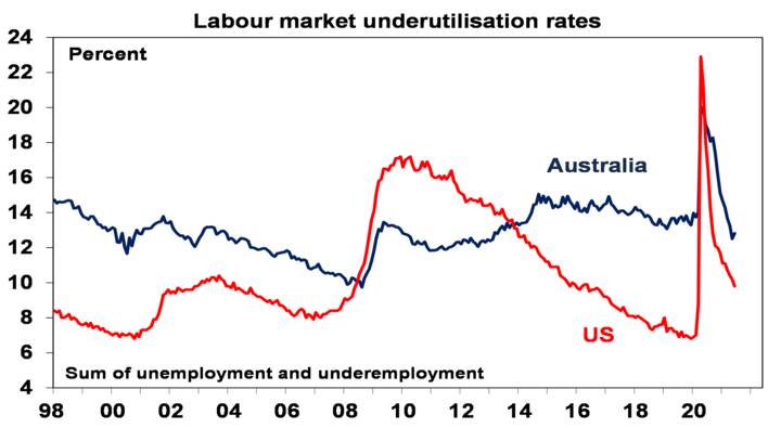
One of the big surprises of this recovery is how quickly jobs came back. This has led to some wage pressures and perceptions that spare capacity has been used up. However, labour underutilisation rates are still relatively high and labour markets are still distorted by the pandemic, eg, by enhanced unemployment benefits in the US & by the closed international border in Australia. So, it still looks like we have a fair way to go to full employment and hence sustained decent wages growth, even without the latest coronavirus-related uncertainties.
Source: Bloomberg, AMP Capital
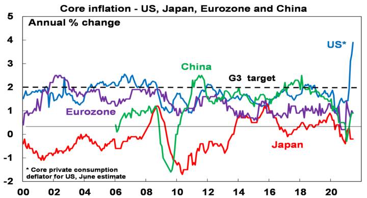
Chart 4 – global inflation
This year has seen an inflation scare with surging raw material prices and US consumer inflation. Core (ex food and energy) CPI inflation in the US has surged to 4.5%yoy but this has been driven by a handful of pandemic-impacted categories (like used car prices up 45%yoy) whereas the rest of the core CPI is up just 2%yoy. And core inflation in China, Europe and Japan is running 0.9%yoy or less. Underlying inflation in Australia still looks to be around 1.6%yoy.
Source: Bloomberg, AMP Capital
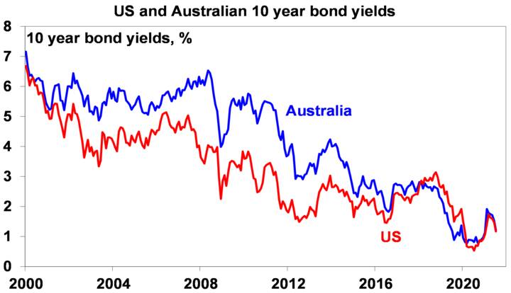
Chart 5 – bond yields
10-year bond yields surged early this year (to 1.7% in the US & 1.9% in Australia) on inflation fears, strong growth & expectations of less central bank bond buying but have since plunged (back to around 1.2% in the US and Australia) on fears about rising new coronavirus cases, concerns we have seen the peak in GDP growth, increased confidence the inflation spike is transitory and a short covering rally (as investors closed underweight positions).
Source: NBER, Bloomberg, AMP Capital
This looks more like a correction than a trend reversal and we anticipate that the rising trend in bond yields will resume as the global recovery continues, vaccines work and vaccination rates rise. But in the meantime, it has removed the near term threat of a 1994 style bond crash leading to a collapse in shares.
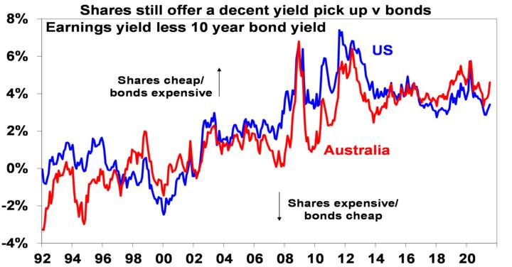
Chart 6 – the gap between earnings and bond yields
The rebound in company earnings has seen price to earnings multiples decline from recent highs despite the strength in share markets this year, resulting in higher earnings yields. At the same time, the decline in bond yields has increased the risk premium shares offer over bonds – as proxied by the earnings yield less the bond yield. In other words, shares have become more attractive again after seeing declining attractiveness into early this year.
Source: Thomson Reuters, AMP Capital
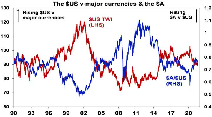
Chart 7 – the US dollar
The US dollar is a counter cyclical currency so big moves in it against a range of currencies are of global significance and bear close watching. Due to the relatively low exposure of the US economy to cyclical sectors like manufacturing and materials, the $US tends to be a “risk-off” currency, ie, it goes up when there are worries about global growth and down when the outlook brightens. If we are right and the global economy continues to recover beyond near term Delta coronavirus concerns, then the $US is likely to decline further (the red line in the next chart will fall further). Recently it’s been going in the wrong direction raising a flag and it could still go up further, which has seen the $A (a “risk-on” currency) decline. However, we anticipate the $US will resume its downswing later this year as vaccines prove their worth and the global economic recovery resumes.
Source: Bloomberg, AMP Capital
Concluding comments
Share markets have had very strong gains from their March 2020 lows (up 96% in the US and up 62% in Australia) and strong gains year to date. This has left them vulnerable to a near term correction – and the US inflation scare and renewed coronavirus fears may provide the trigger. However, this is more likely to be a correction than a trend change as the global and Australian economic recoveries ultimately continue. For further solid gains, beyond likely near-term setbacks, the indicators shown in these charts are worth keeping an eye on.


