Introduction
Investing is often seen as complicated. This has been made worse over the years by: the increasing complexity in terms of investment products and choices; regulations and rules around investing; the role of the information revolution and social media in amplifying the noise around investment markets; and the expanding ways available to access and transact in various investments. But at its core, the basic principles of successful investing are simple & timeless. One way to demonstrate that is in charts or pictures. So, this note updates five charts I find useful in understanding investing. Of course, there are more than five, so I’ll put out part 2 in a few weeks. These charts are useful in times like the present where the noise has reached fever pitch with the pandemic, rising inflation, rising interest rates & war in Ukraine making the short-term outlook uncertain.
Chart #1 The power of compound interest
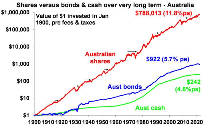
This chart is my absolute favourite and became ingrained in my thinking after many years of hearing my good friend, the well-known economist Dr Don Stammer, expound on the magic of compounding. He is right – compound interest which sees returns compound on top of past returns is like magic!
Data shown is prior to any fees and taxes. Source: Bloomberg, ASX, RBA, AMP
The chart shows the value of $1 invested in various Australian assets in 1900 allowing for the reinvestment of dividends and interest along the way. That $1 would have grown to $242 if invested in cash, to $922 if invested in bonds and to $788,013 if invested in shares. While the average return since 1900 is only double that in shares relative to bonds, the huge difference between the two at the end owes to the impact of compounding or earning returns on top of returns. So, any interest or return earned in one period is added to the original investment so that it all earns a return in the next period. And so on.
The “Law of 72” is a useful tool to understanding how long it takes an investment to double in value using compounding. Just divide the rate of return into 72 and that’s the answer (roughly). For example, if the rate of return is 1% pa (eg, the interest rate on a bank term deposit if you’re lucky), it will take 72 years to double in value (= 72 divided by 1). But if it’s, say, 8% pa (eg, the expected return from Australian shares including dividends), then it will take just 9 years (= 72 divided by 8).
Key message: if we want to grow our wealth, we must have exposure to growth assets like shares and property.
Chart #2 The cycle
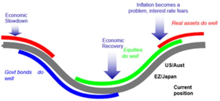
Of course, shares can have lots of setbacks along the way as is particularly evident during the periods highlighted by the arrows on the share market line. And they are vulnerable to the uncertainties around inflation and the war in Ukraine at present. In fact, the higher returns shares generate over time relative to cash and bonds is compensation for the periodic short-term setbacks they suffer from. But understanding those periodic setbacks – that there will always be a cycle – is important in not getting thrown off the higher returns that shares and other growth assets provide over the longer term. The next chart shows a very stylised version of the investment cycle.
Source: AMP
The grey line shows the economic cycle from “boom” to “bust” to “boom” again. Prior to the low point in the economic cycle, shares invariably find a bottom thanks to attractive valuations and easy monetary policy and as smart investors look forward to an economic recovery. This phase is usually characterised by scepticism. Shares then move higher, eventually supported by stronger earnings on the back of economic recovery, which eventually gives way to a blow off phase or euphoria as investors pile in. This is ultimately brought to an end as rising inflation flowing from strong economic conditions results in ever-tightening monetary policy, which combines with smart investors anticipating an economic downturn and results in shares coming under pressure. Usually around the top of the cycle real assets – like property and infrastructure – are a better bet than shares as they benefit from strong real economic conditions. But once the downturn hits, bonds are usually the place to be as slowing growth eventually gives way to falling inflation, all of which sees bond yields decline, producing capital gains for investors. At some point, of course, easing monetary conditions and attractive valuations see shares bottom out and the whole cycle repeats. Of course, the details of each cycle are different and sometimes “external” events like the coronavirus pandemic or wars can drive downturns even when we are not seeing the sort of cyclical excess usually seen at market tops.
Key message: cycles are a fact of life and while they don’t repeat precisely, they rhyme. It’s invariably the case that the share market leads the economic cycle (bottoming out before economic recovery is clear and topping out before an economic downturn has really hit and vice versa at tops) and that different assets perform relatively best at different phases in the cycle.
Chart #3 The roller coaster of investor emotion
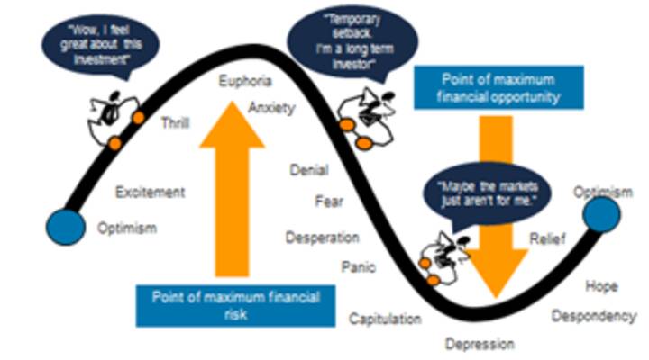
The swings we see in investment markets are far greater than can be justified by movements in investment fundamentals alone – ie profits, dividends, rents, interest rates, etc. In fact, investor emotion plays a huge part. The next chart shows the roller coaster that investor emotion traces through the course of an investment cycle. A bull market runs through optimism, excitement, thrill and ultimately euphoria by which point the asset class is over loved (and usually overvalued too) – everyone who is going to buy has – and it becomes vulnerable to bad news. This is the point of maximum risk. Once the cycle starts to turn down in a bear market, euphoria gives way to anxiety, denial, fear, capitulation and ultimately depression at which point the asset class is under loved (and usually undervalued) – everyone who is going to sell has – and it becomes susceptible to good (or less bad) news. This is the point of maximum opportunity. Once the cycle turns up again, depression gives way to hope, relief and optimism before eventually moving on to euphoria again.
Source: Russell Investments, AMP
Key message: investor emotion plays a huge roll in amplifying the investment cycle. The key for investors is not to get sucked into this emotional roller coaster: avoid assets where the crowd is euphoric and convinced it’s a sure thing, and favour assets where the crowd is depressed and the asset is under loved. Of course, doing this is often easier said than done.
Chart #4 The wall of worry
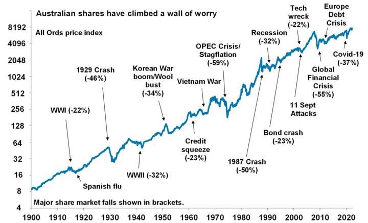
It seems that these days there is always something for investors to worry about. This year it’s particularly the case with surging inflation, supply shortages, central banks tightening monetary policy, rising bond yields, concerns that inverting yield curves may be signalling recession, war in Ukraine and all against the backdrop of periodic coronavirus waves. But while this is real and adds to uncertainty, in a long-term context its mostly noise. The global and Australian economies have had plenty of worries over the last century, but it got over them with Australian shares returning 11.8% per annum since 1900, with a broad rising trend in the All Ords price index as can be seen in the next chart, and US shares returning 9.8% pa. (Note, this chart shows the All Ords share price index, whereas the first chart shows the value of $1 invested in an accumulation index, which allows for changes in share prices and dividends.)
Source: ASX, AMP
Key message: worries are normal around the economy and investment markets but most of them turn out to be no more than short term noise.
Chart #5 Time is on your side
Investment markets bounce all over the place in the short term. As can be seen in the next chart even annual returns in the share market are highly volatile, but longer-term returns tend to be solid and relatively smooth. Since 1900 for Australian shares roughly two years out of ten have had negative returns but there are no negative returns over rolling 20-year periods. (It’s roughly two & a half years out of 10 for US shares since 1900.)
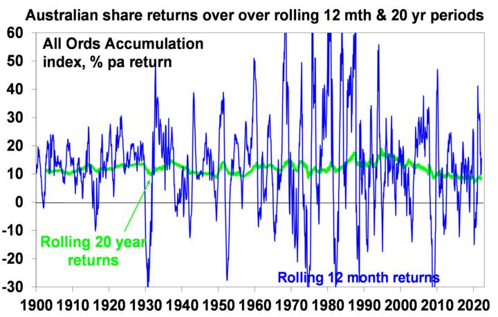
Data is shown prior to any fees and taxes. Source: Bloomberg, ASX, RBA, AMP
Key message: short term share returns can sometimes see violent swings, but the longer the time horizon the greater the chance your investments will meet their goals. It’s also extremely hard to time these short-term swings. So in investing, time is on your side and its best to invest for the long-term.


